Typography
Learn about our brand's typography, including primary fonts, hierarchy, and usage guidelines.
Seattle University employs three separate brand typefaces for all printed materials. Using these typefaces will help ensure that our visual communications are consistent and engaging.
Limited licenses are available for these typeface. Log in to the Redhawk Hub for free alternative options as well as guidelines and recommendations about how to use these typefaces.
Neutraface 2
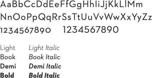
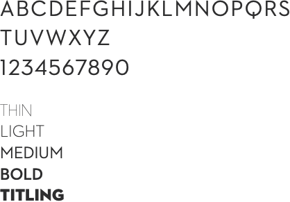
Neutraface 2 Is a clean and modern sans serif typeface that is ideal for use across all printed material for the university. It incorporates a system with Text and Display options with each containing multiple weights. This allows it to be utilized for multiple purposes across the brand.
Neutraface 2 Text
Neutraface 2 Display
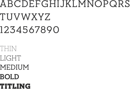
Neutraface Slab
Is the equivalent to Neutraface 2 but with slab serifs which help bring a more collegiate and academic feel when used. It also incorporates a system with Text and Display options with various weights that allow it to be utilized for multiple purposes. It functions especially well for pull quotes, sub-headlines and introductory paragraphs.
Neutraface Slab Text
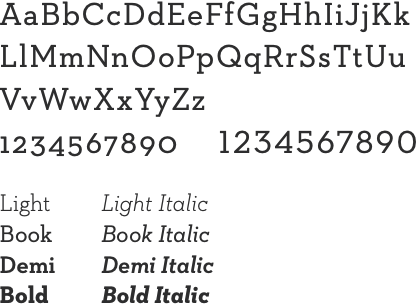
Neutraface Slab Display
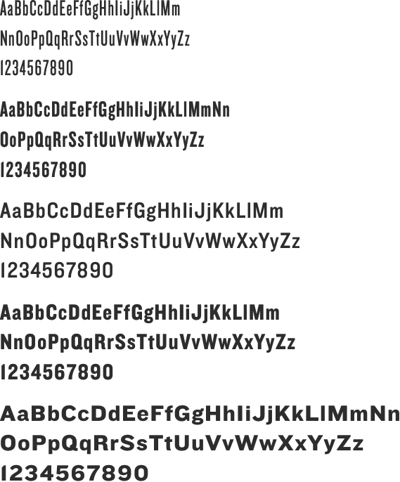
Knockout
Knockout is a distinct typeface with a long list of weights that help bring diversity and spirit to the brand. Knockout is used for headlines and should always be in all capitals. Recommended weights used within the brand are 27, 28, 30, 31, 32, 48, 50, and 52. Never use Knockout for body copy.
